Premature Conversion
Premature conversion happens when a page asks users to sign up, donate, create an account, check out, or hand over personal data before they understand the offer.
It breaks information scent, raises cognitive load, and triggers psychological reactance. User intent is exploratory; the surface treats it as transactional.
The result is silent abandonment, distrust, and lower-quality intent.
The fix is not to remove CTAs. Sequence them: orient first, ask second, and keep a shortcut visible for ready users.
Examples
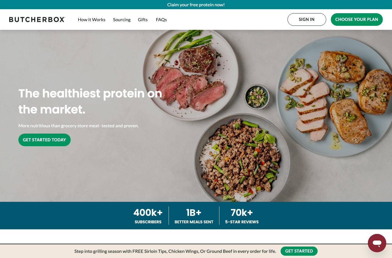
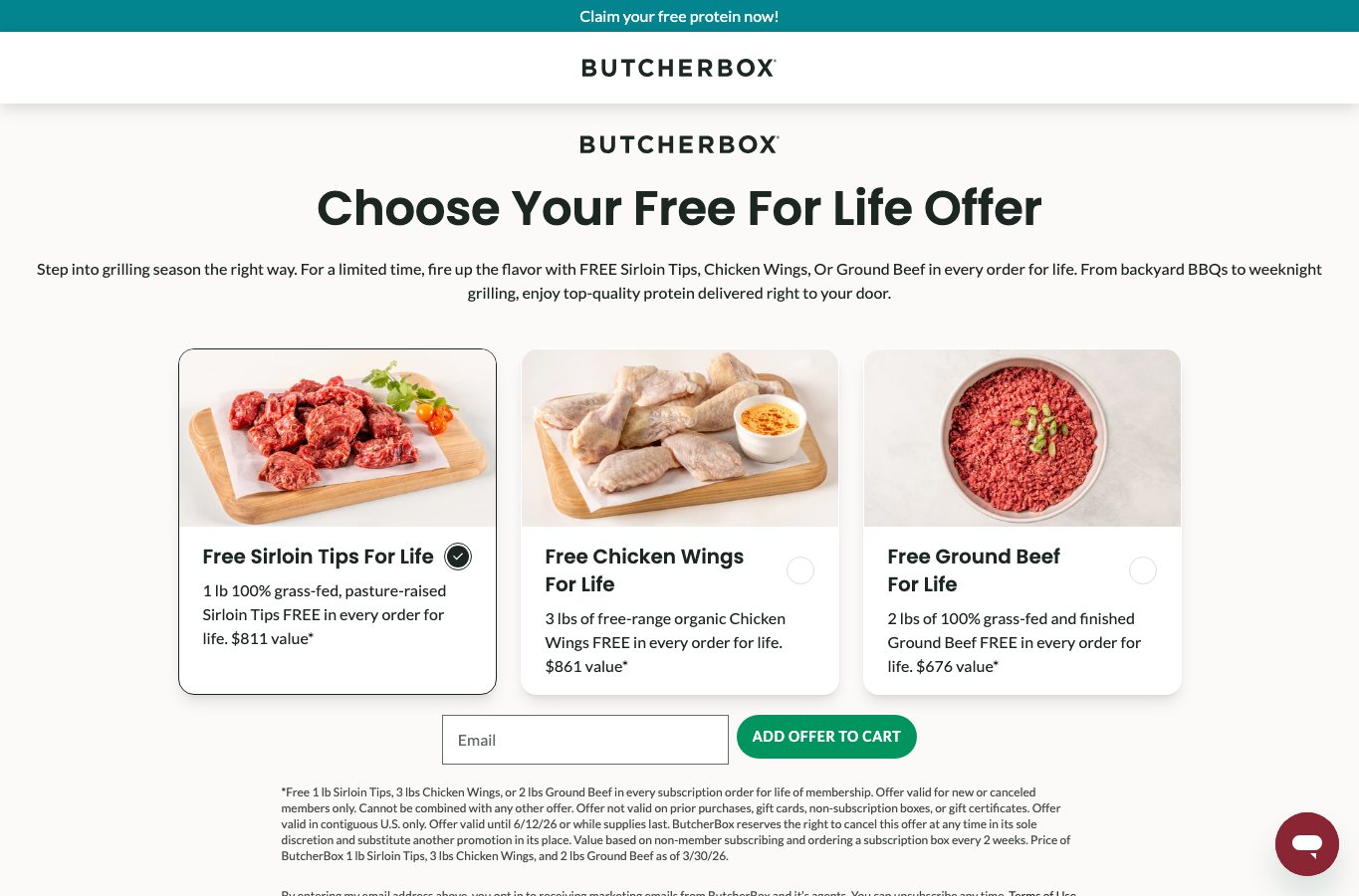
Clear match8 examples
The anti-pattern is the central failure: the page blocks progress before the user's expectation is satisfied.

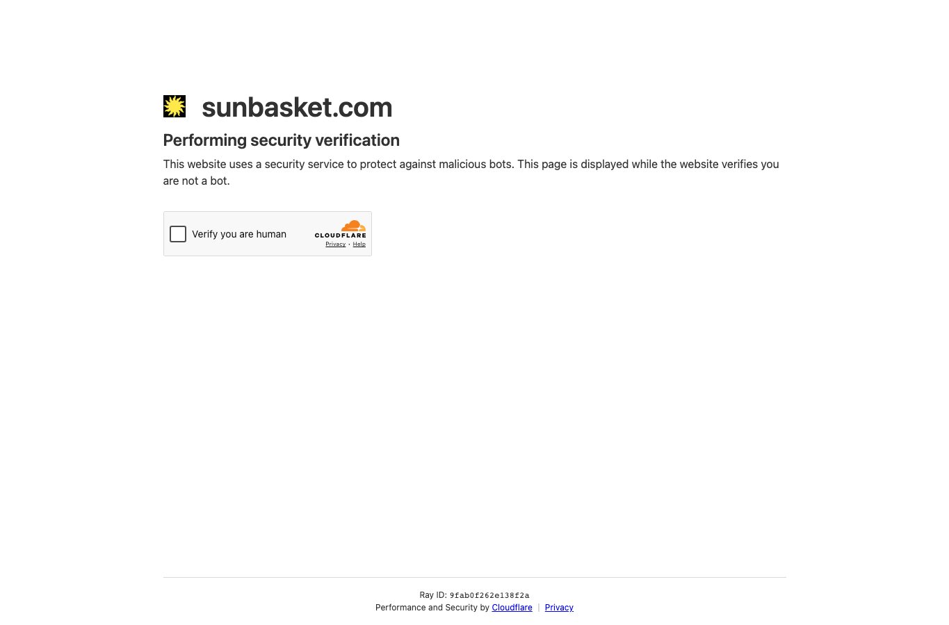
Automation challenge or bot protection was shown.
Partial capture · May 12, 2026
Partial match2 examples
The pattern is present but mixed with mitigating factors such as partial preview, delayed walls, or product constraints.
Boundary case2 examples
The surface resembles the pattern, but context may change the diagnosis or mark a safer edge.
Research
Early account creation and checkout frictionBaymard Institute
Forced account creation is one of the clearest adjacent-context signals: 19% of non-browsing checkout abandoners cite it, and meal-kit testing shows the same email-wall-before-plan failure.
CTA expectation mismatch and login wallsNielsen Norman Group, Baymard Institute
Generic CTAs and login walls weaken information scent when users expect explanation but get commitment. Authentication is strongest when it is inherently tied to user value.
Cognitive mechanismInformation foraging, cognitive load, reactance
The pattern combines weak scent, unnecessary decision effort, and perceived autonomy threat. That combination turns exploratory intent into abandonment or distrust.
Accessibility and form orientationW3C, GOV.UK Design System
Descriptive links, visible labels, clear required states, language metadata, and focused form steps reduce avoidable uncertainty for everyone, especially assistive-tech users.
Workflow
1Diagnostic assessmentCheck whether the surface asks for commitment before orientation.
- The hero answers what this is, who it is for, and why it matters in one screen
- There is exactly one dominant hero CTA
- A softer orientation CTA exists - "See how it works," "Compare options," "Learn more"
- High-intent shortcuts live in the header or sticky nav
- No generic "Get Started" without explicit expectation-setting
- No mandatory personal-data ask before preview unless the product is inherently private
- Optional account creation is delayed and previewed with microcopy
- The page includes a visible compare or "How it works" section before the form
- Every form field has a visible, programmatic label and required-state clarity
- Analytics distinguish orientation events from commitment events
2Fix planningMap problem signs to sequencing fixes and expected KPI movement.
| Problem sign | Design fix | KPI movement |
|---|---|---|
| Hero asks for commitment before value is clear | Lead with what / who / why before the hard CTA | Lower bounce and higher engagement |
| CTA says Get Started but leads to a form | Use destination-revealing labels | Lower CTA misfire |
| Account wall blocks checkout | Offer guest-first checkout and delay account creation | Lower wall abandonment |
| Exploratory users need more context | Add How it works and comparison paths before forms | Higher orientation CTR |
3Experiment planningEvaluate informed progression, not raw CTA clicks.
| Experiment | Control | Variant | Metric |
|---|---|---|---|
| Orientation-first hero | Immediate hard CTA | Hero answers what / who / why first | Bounce rate and engaged sessions |
| Generic CTA wording | Get Started | See pricing or Compare options | CTA misfire rate |
| Account timing | Create account before checkout | Optional account on confirmation | Checkout completion |
4Measurement planningInstrument orientation separately from commitment.
Track landing view, orientation CTA clicks, hard CTA clicks, signup-wall views, first field interaction, form submit, checkout completion, optional account creation, and support contact events. Segment by new vs returning visitors, source, device, and locale.
Knowledge Links
- Login walls before value
- Hidden guest checkout
- Ambiguous CTA labels
- Opaque option differences
- Fragmented forms
- Orientation-first hero
- Destination-revealing CTA labels
- Guest-first checkout
- Delayed optional account creation
- Three-level How It Works architecture